I worked with Dr. Sarah Masud Preum, a Dartmouth Computer Science professor, and Mike D'Andrea, a Google NYC UX Researcher, to conduct generative user research for an adaptive medication reminder app.
This project allowed me to zoom in on UX research, exploring different quantitative and qualitative analysis methods such as diary studies, surveys, and interviews, which went on to inform my data-driven design process.
Timeline
3 weeks
Team
1 UX Researcher
1 UXR Mentor
Deliverables
Competitive Analysis
Personas
Challenge
Current medication reminder methods are insensitive to the complex contexts that medicine is taken under, leading to medication non-adherence which contributes to treatment failures.
Dr. Sarah Masud Preum, a computer science professor at Dartmouth, knows that taking medication is not as simple as a yes or no. Current medication reminder apps earn millions of downloads, but frame medication adherence as a binary issue: did you take the medicine or not?
In her research of medication adherence and the systems that can enforce it, she has found that these apps are insensitive to the real human experience of taking medication and ineffective.
Dr. Preum, in association with Geisel School of Medicine, Thayer School of Engineering, and Google UXR Mike D'Andrea, approached me as a partner to conduct a comprehensive user research project to examine the market of medication reminder apps and the habits of prescription medication takers.
Results
I conducted primary and secondary generative UX research over a 3-week period, creating a roadmap, collecting insights, and organizing deliverables.
I learned how to further formalize the research portion of UX projects through additional research methods and frameworks, as well as gained experience in independent UX work as opposed to my usual cross-functional teams.
My Process
Framing the Problem: First things first, I conducted a Project Kickoff and Discovery session with the client to synthesize my definitions of the problems we were going to tackle together.
Research Plan: Based on my conversation with the client, I meticulously outlined a roadmap for the next 3 weeks with my mentor. We decided that both primary and secondary research would be needed to properly nuance the results.
I chose to conduct a competitive analysis as my form of secondary research to understand the current medication app market, as one of the client's major goals was to differentiate from what she perceived the current market to be.
As for primary research, I chose a diary study to see what medication-takers daily habits were.
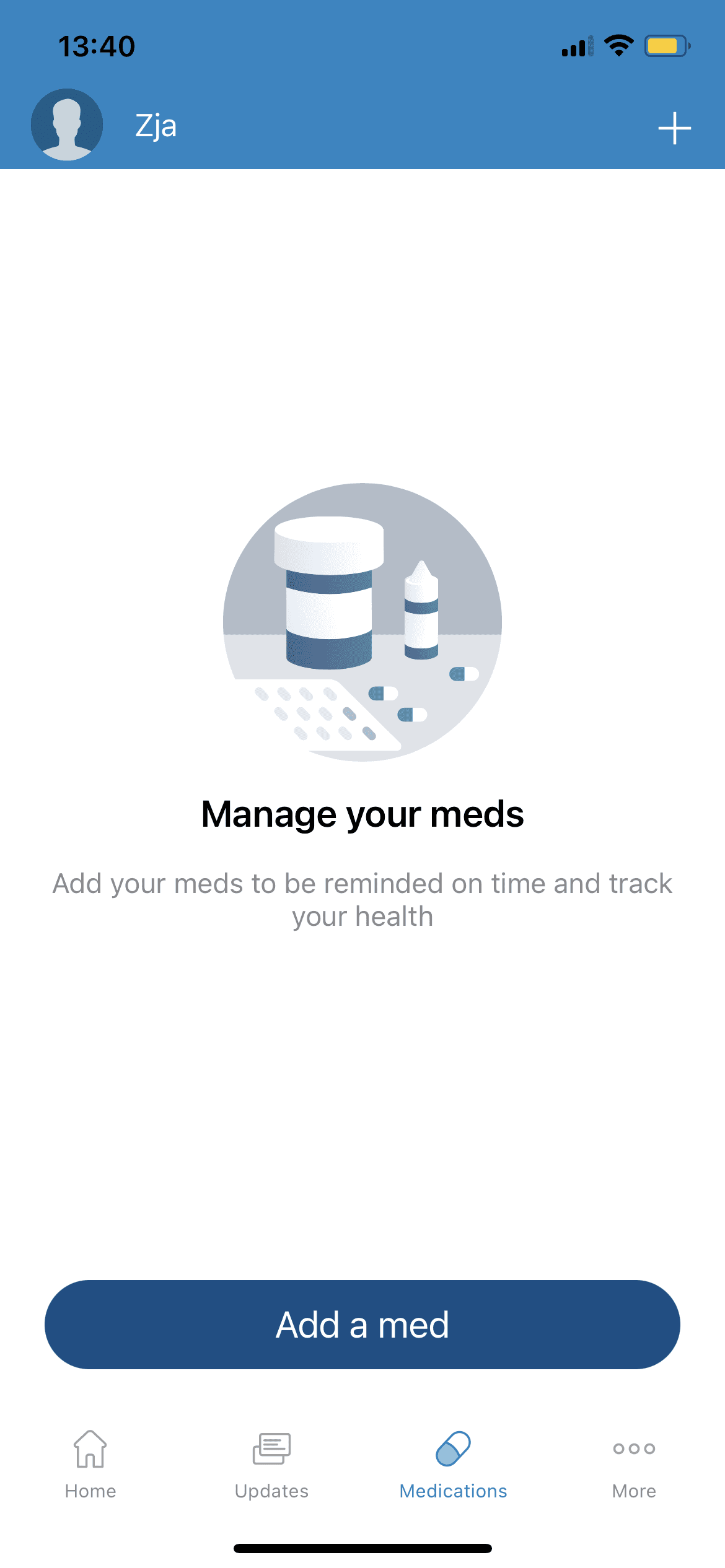
Competitive Analysis: In this competitive analysis, I analyzed 5 apps on their user interface and experience. Some were chosen for being market leaders, while others were chosen for having unique features, such as a cycle tracking app.
Key Takeaways
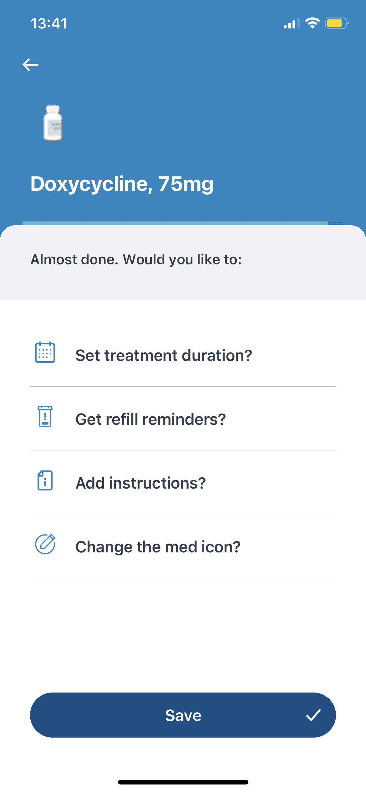
Apps on the market currently range between highly customizable w/ an extensive onboarding process, to simple + straightforward apps whose sole purpose is to notify.
Despite some apps being highly customizable throughout their onboarding process, the notifications themselves are only customizable by name, visual/audio cues, time, and number of repeats.
Symptom + medication tracking keep a record for the user, but the data collected does not affect future user experiences.
App
Medisafe
About Medisafe
Medisafe is the leading medication engagement platform, with millions of downloads and a significant user base.
The app offers highly customizable ways for users to track and monitor their medication adherence.
Medisafe has many features including warnings for medication interactions, a diary, and appointment reminders.
Observations & Key Features
Key Features
Reminders
Appointments
Streaks
Multiple Users
Refill Reminders
Layout
Visual Design
Blue color associated with intelligence + calmness
Simple interface, lack of flair leads to clean + minimalistic feel
Highly customizable, lists options by vertical list
No visible branding elements or distinct app identity
UX Design
Again, highly customizable. Onboarding contains a series of questions to tailor user experience.
In adding a medication, there are again many customizations the user can make.
Lastly, a “more” page leads them to a diary + reminder section, where they can track their history + medical appointments.
App
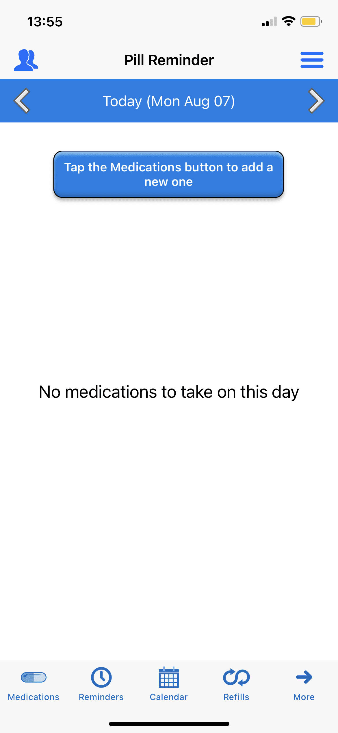
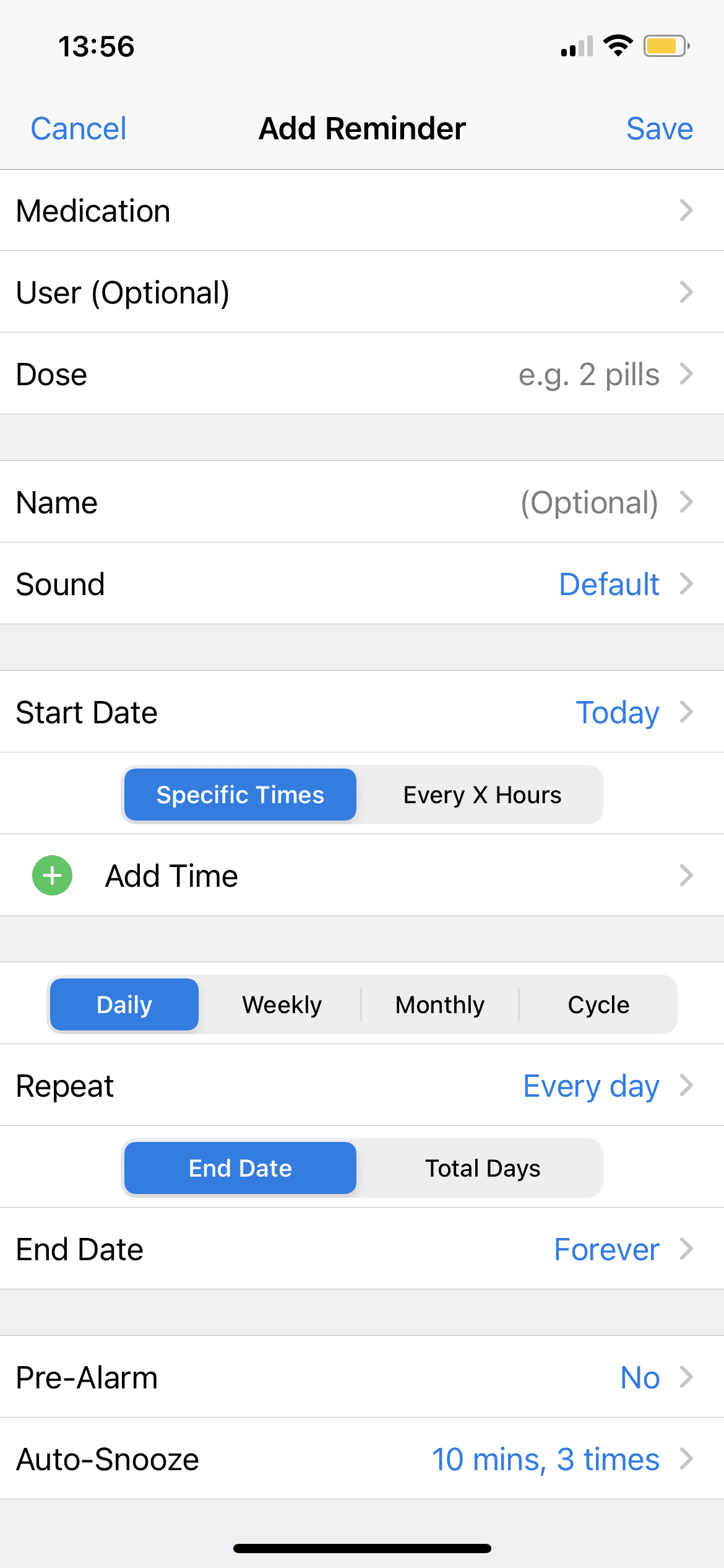
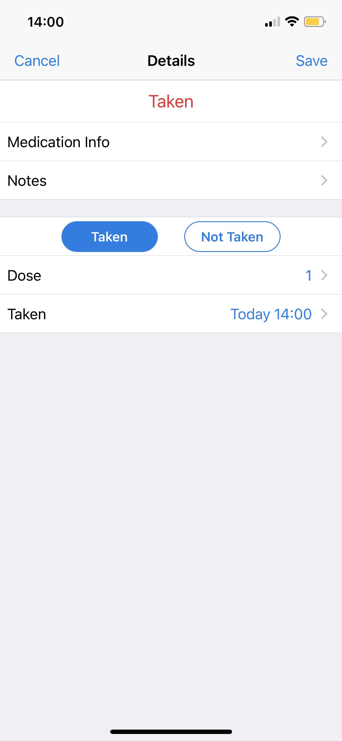
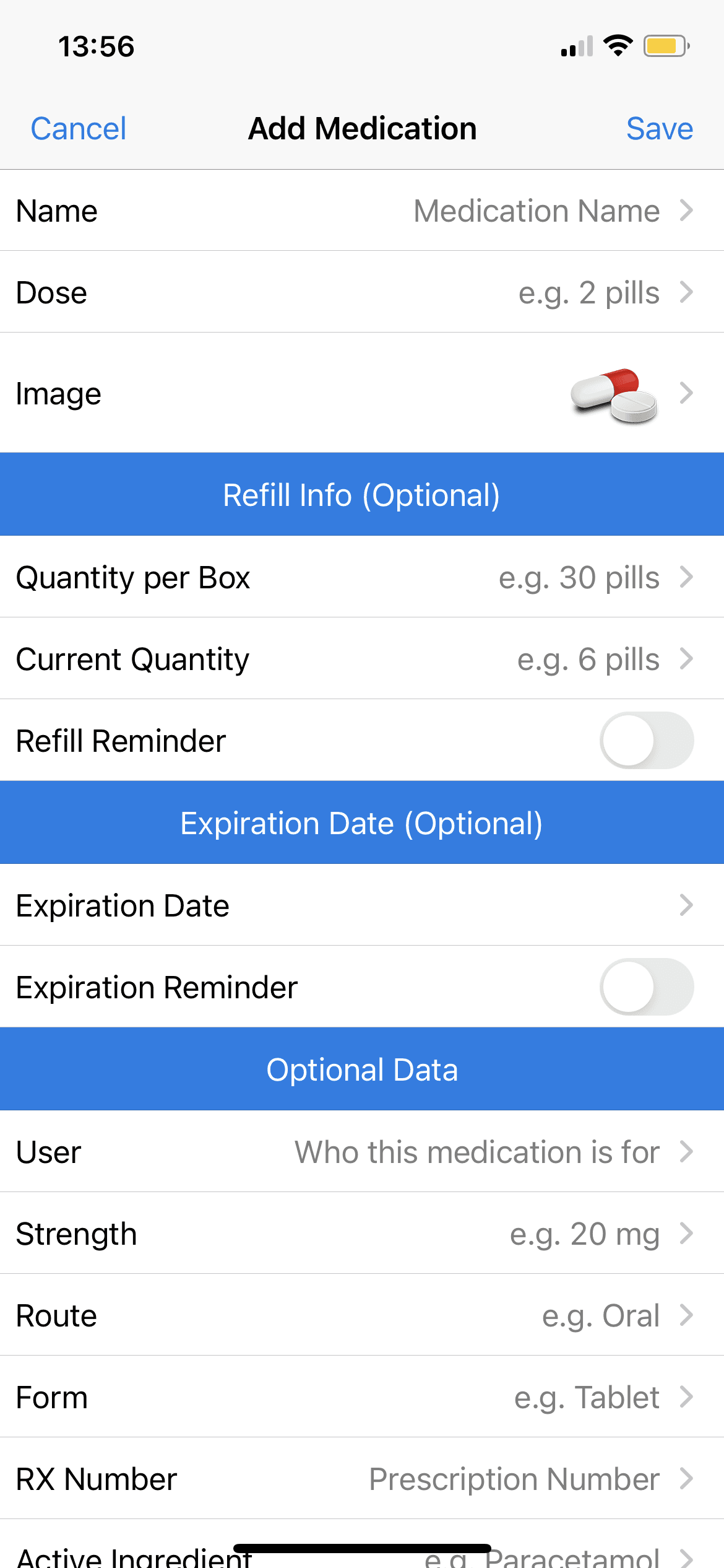
Pill Reminder
About Pill Reminder
Pill Reminder has over 20 thousand ratings on the app store and was copyrighted in 2011 by Sergio Licea.
The app prioritizes having a simple user interface and is well-reviewed for its simplicity and customizability.
Observations & Key Features
Key Features
Layout
Visual Design
Basic UI reminiscent of default system designs
Bottom navigation bar unintuitive (have to tap “More” to see other tabs)
Notification contains image, medication name, and Time Sensitive indication
Blue accent color, mostly whites and grays akin to Apple system
UX Design
App is relatively straightforward in UX design without much creative ideation away from basic features, settings, + notifications.
Optional customization settings for adding medications, related to strength, length of treatment, and prescription number.
Recurring reminders (repeat every X hours)
Reminders
Appointments
Streaks
Multiple Users
Refill Reminders
App
Max
About Max
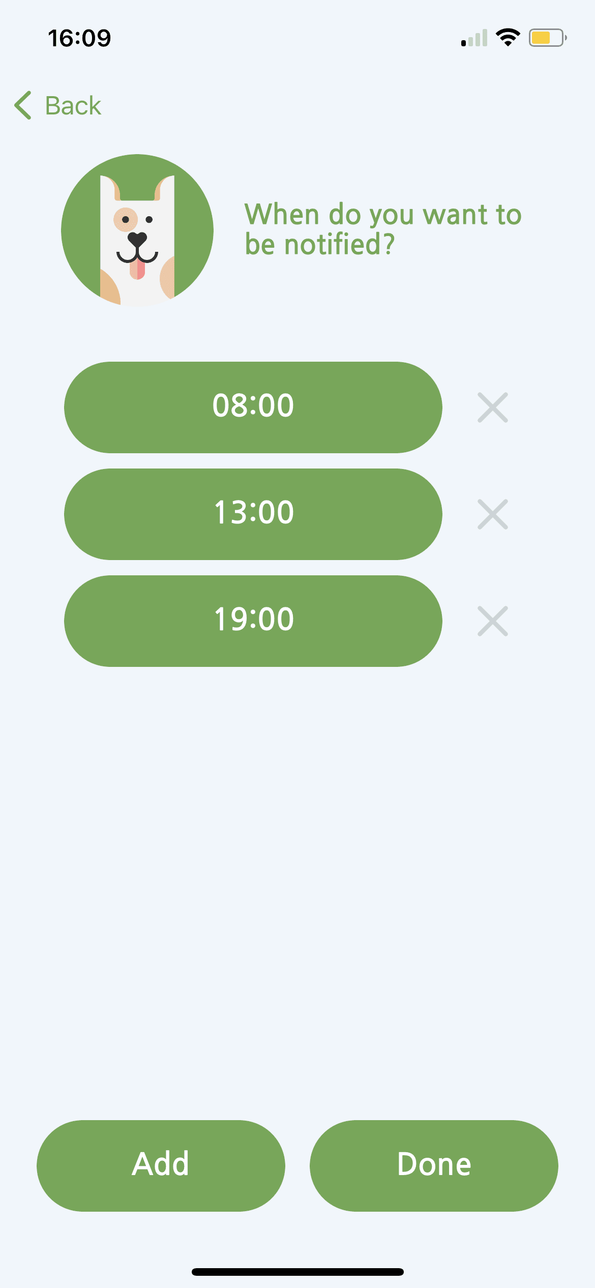
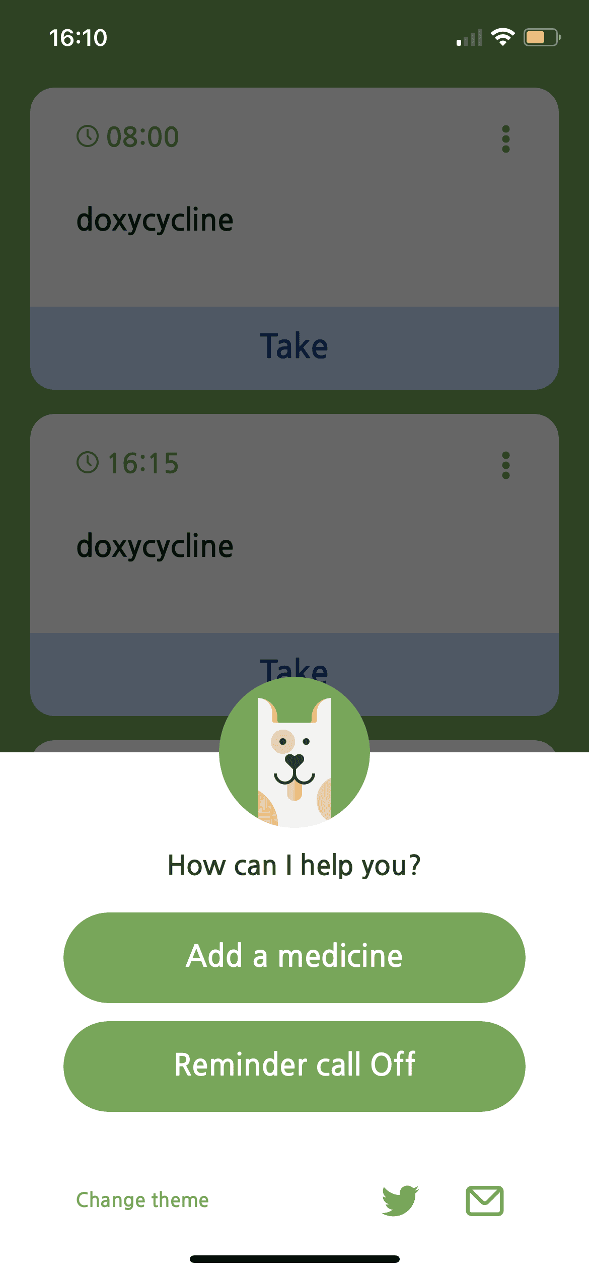
Max is a medication reminder app with a priority on playful, simple notifications. The app is a single-use app and its sole purpose is to notify the user to take their medication at the correct time and intervals.
The app has a more creatively-designed interface than other apps on the medication reminder app market, using a dog “Max” to remind the user of their medications.
Observations & Key Features
Key Features
Layout
Visual Design
Green accent color, which is often association with wellbeing + growth
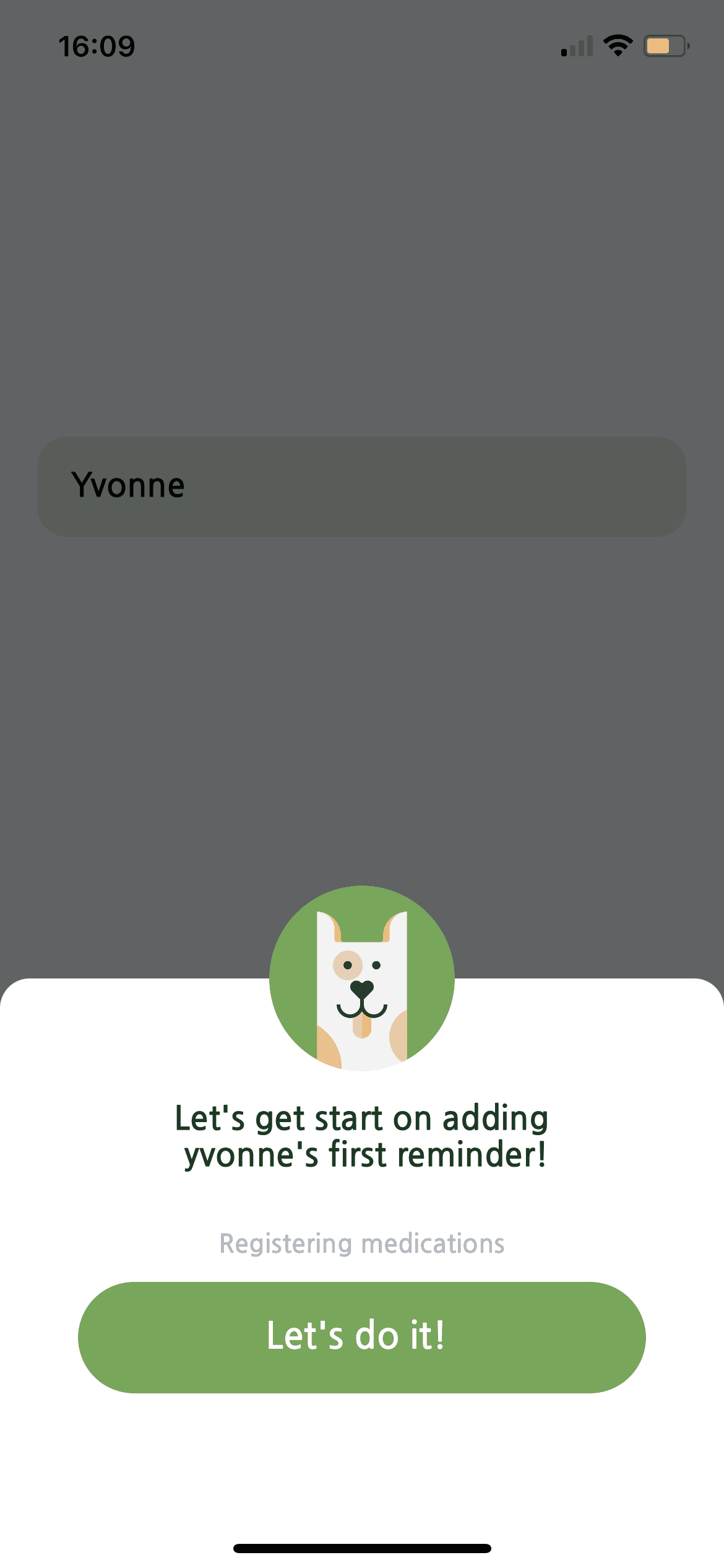
Very simple onboarding
Animal iconography and characters are present throughout different screens of the app and notifications
UX Design
Single feature of app is to set timed notifications for medication taking.
There is not much customization.
No settings page
Not an all-in-one app
Reminders
Appointments
Streaks
Multiple Users
Refill Reminders
App
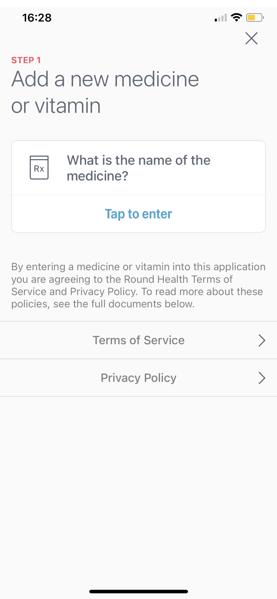
Round Health
About Round Health
Round Health is an app that prioritizes having a simple, beautiful interface for users to intuitively understand and remember when to take their medication. The app functions with Apple Watch and has many features like special customization for birth control packs, persistent push notifications, and streaks.
Observations & Key Features
Key Features
Layout
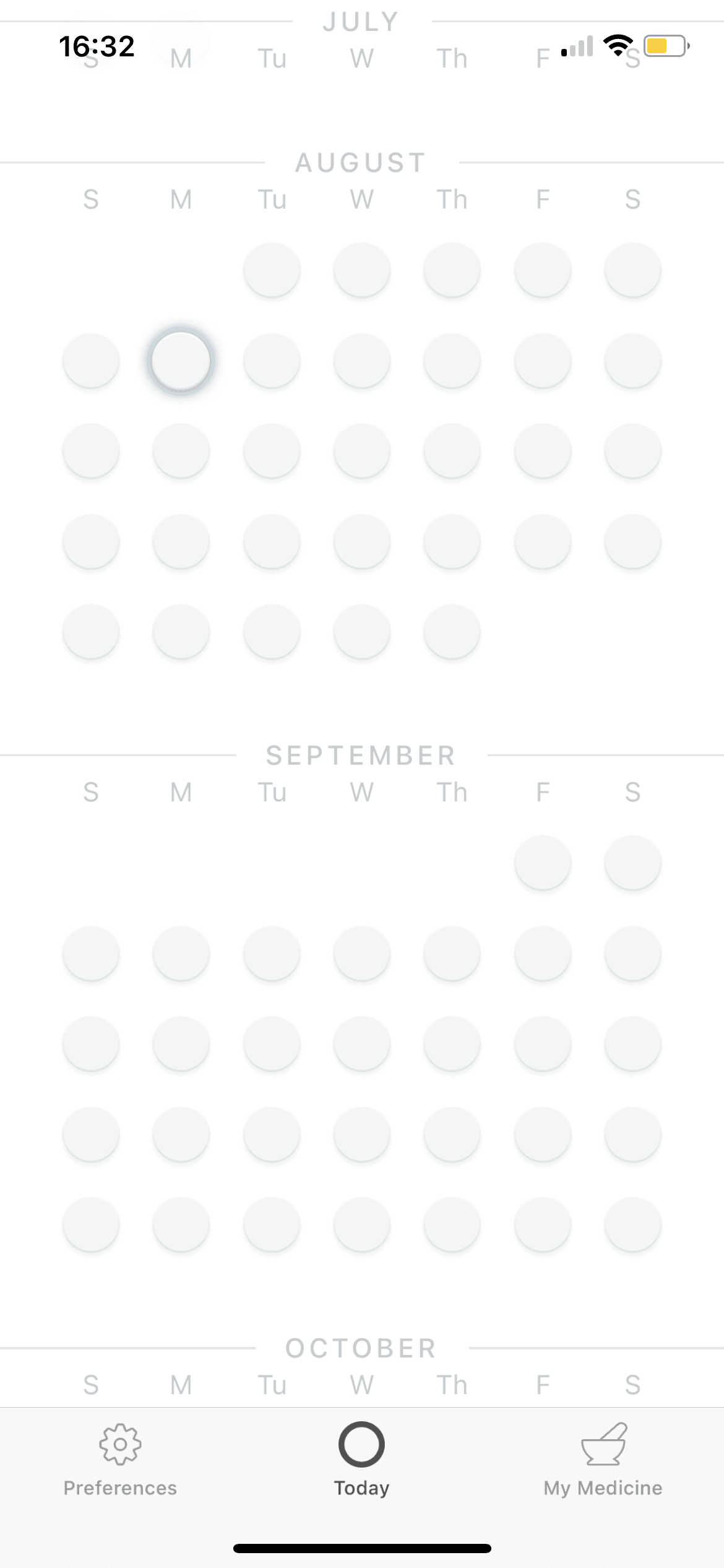
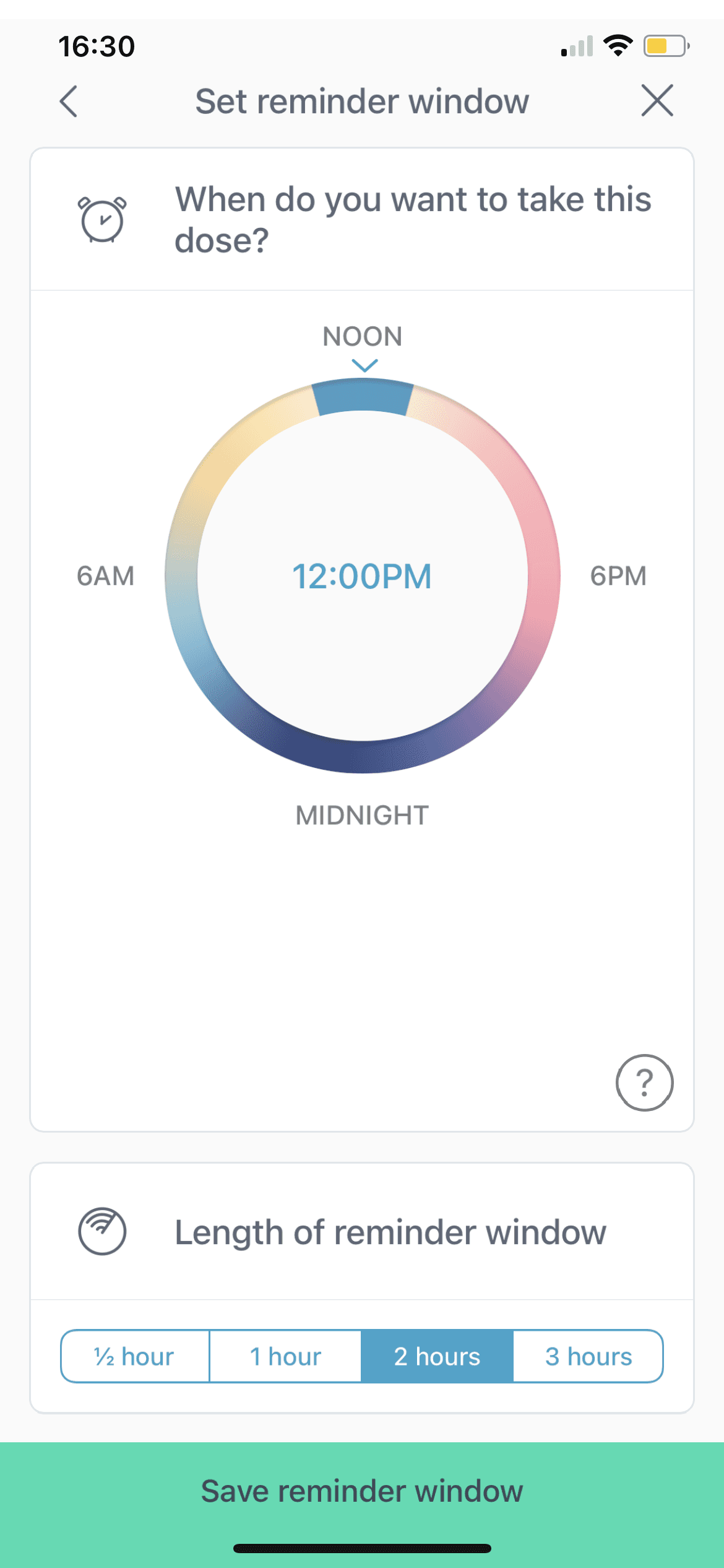
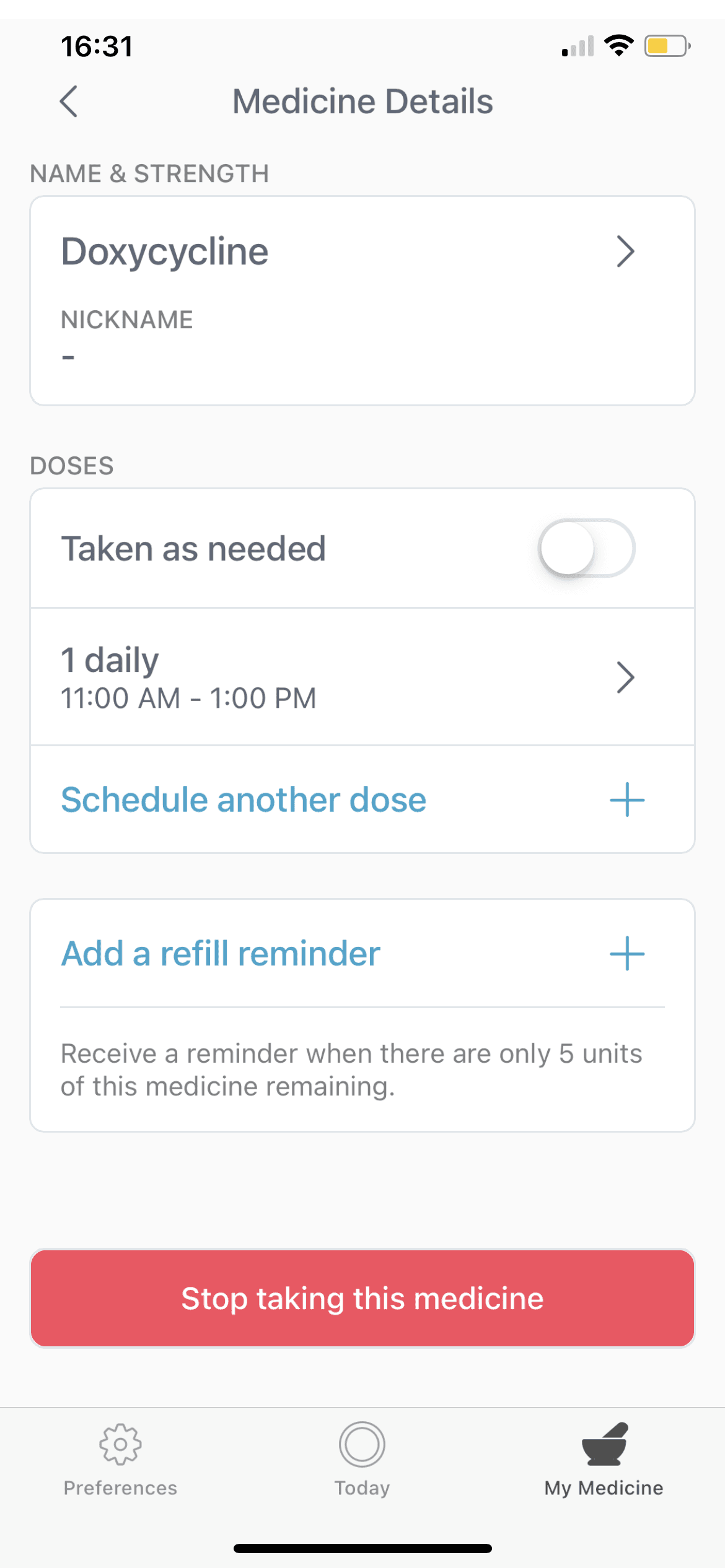
Visual Design
Clean UI w/ mostly white + accents
Visualization using calendars and time
Simple navigation bar
UX Design
Main screen is a simple circle indicating time medication is intended to be taken and a completion screen.
Settings provide some customization for notifications, but mostly are for feedback, policies, and FAQs.
Reminders
Appointments
Streaks
Multiple Users
Refill Reminders
App
Flo
About Flo
Over 250 million people use Flo, which functions as an ovulation and period tracker, fertility calendar, and pregnancy assistant. Users update the app daily based on their symptoms to track their menstrual cycles and receive accurate predictions of future symptoms. Guided by an international team of health experts, Flo aims to provide safe, evidence-based information tracking for people with menstrual cycles.
Observations & Key Features
Key Features
Layout
Visual Design
Flo employs a clean yet bold UI
Pink accent color associated with love, femininity, + peace
Consistent branding found across site, with strong identity in font, boldness of lines, colors, + icons
Hierarchy in information size
UX Design
Highly customizable w/ a significantly lengthy onboarding process, though there is the option to skip through.
Customization is also highly personal information.
Aims to be a one-stop app w/ medical, sexual, and menstrual tracking and advice.
Reminders
Appointments
Streaks
Multiple Users
Refill Reminders
App
Medisafe
About Medisafe
Medisafe is the leading medication engagement platform, with millions of downloads and a significant user base.
The app offers highly customizable ways for users to track and monitor their medication adherence.
Medisafe has many features including warnings for medication interactions, a diary, and appointment reminders.
Observations & Key Features
Key Features
Reminders
Appointments
Streaks
Multiple Users
Refill Reminders
Layout
Visual Design
Blue color associated with intelligence + calmness
Simple interface, lack of flair leads to clean + minimalistic feel
Highly customizable, lists options by vertical list
No visible branding elements or distinct app identity
UX Design
Again, highly customizable. Onboarding contains a series of questions to tailor user experience.
In adding a medication, there are again many customizations the user can make.
Lastly, a “more” page leads them to a diary + reminder section, where they can track their history + medical appointments.
App
Pill Reminder
About Pill Reminder
Pill Reminder has over 20 thousand ratings on the app store and was copyrighted in 2011 by Sergio Licea.
The app prioritizes having a simple user interface and is well-reviewed for its simplicity and customizability.
Observations & Key Features
Key Features
Layout
Visual Design
Basic UI reminiscent of default system designs
Bottom navigation bar unintuitive (have to tap “More” to see other tabs)
Notification contains image, medication name, and Time Sensitive indication
Blue accent color, mostly whites and grays akin to Apple system
UX Design
App is relatively straightforward in UX design without much creative ideation away from basic features, settings, + notifications.
Optional customization settings for adding medications, related to strength, length of treatment, and prescription number.
Recurring reminders (repeat every X hours)
Reminders
Appointments
Streaks
Multiple Users
Refill Reminders
App
Max
About Max
Max is a medication reminder app with a priority on playful, simple notifications. The app is a single-use app and its sole purpose is to notify the user to take their medication at the correct time and intervals.
The app has a more creatively-designed interface than other apps on the medication reminder app market, using a dog “Max” to remind the user of their medications.
Observations & Key Features
Key Features
Layout
Visual Design
Green accent color, which is often association with wellbeing + growth
Very simple onboarding
Animal iconography and characters are present throughout different screens of the app and notifications
UX Design
Single feature of app is to set timed notifications for medication taking.
There is not much customization.
No settings page
Not an all-in-one app
Reminders
Appointments
Streaks
Multiple Users
Refill Reminders
App
Round Health
About Round Health
Round Health is an app that prioritizes having a simple, beautiful interface for users to intuitively understand and remember when to take their medication. The app functions with Apple Watch and has many features like special customization for birth control packs, persistent push notifications, and streaks.
Observations & Key Features
Key Features
Layout
Visual Design
Clean UI w/ mostly white + accents
Visualization using calendars and time
Simple navigation bar
UX Design
Main screen is a simple circle indicating time medication is intended to be taken and a completion screen.
Settings provide some customization for notifications, but mostly are for feedback, policies, and FAQs.
Reminders
Appointments
Streaks
Multiple Users
Refill Reminders
App
Flo
About Flo
Over 250 million people use Flo, which functions as an ovulation and period tracker, fertility calendar, and pregnancy assistant. Users update the app daily based on their symptoms to track their menstrual cycles and receive accurate predictions of future symptoms. Guided by an international team of health experts, Flo aims to provide safe, evidence-based information tracking for people with menstrual cycles.
Observations & Key Features
Key Features
Layout
Visual Design
Flo employs a clean yet bold UI
Pink accent color associated with love, femininity, + peace
Consistent branding found across site, with strong identity in font, boldness of lines, colors, + icons
Hierarchy in information size
UX Design
Highly customizable w/ a significantly lengthy onboarding process, though there is the option to skip through.
Customization is also highly personal information.
Aims to be a one-stop app w/ medical, sexual, and menstrual tracking and advice.
Reminders
Appointments
Streaks
Multiple Users
Refill Reminders
I conducted a SWOT analysis on the potential medication reminder app to comprehensively evaluate its feasibility and potential impact, and present the most significant opportunities and threats to Dr. Preum to keep in mind as she builds out the app.
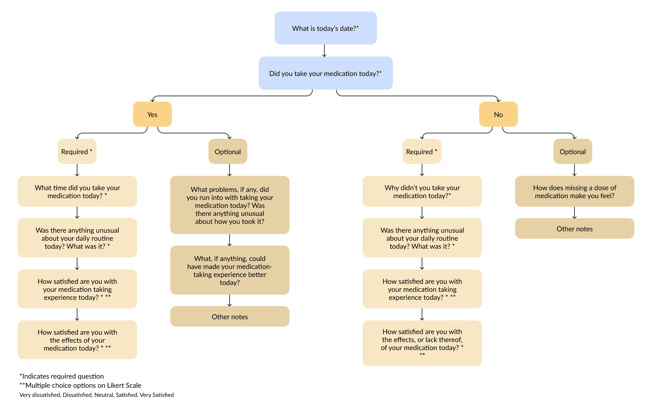
Diary Study: Because Dr. Preum sought to understand how people actually interact with their medication in their complicated daily lives, I wanted to conduct a diary study in addition to my competitive analysis, where I would collect daily data from patients over the course of 7 days on whether and how they took their medication.
I chose this method so I would get not only more quantitative insights, but more realistic insights as patients would be reporting in real-time how taking or missing their medication dose for the day made them feel.
My question flow is pictured below:
However, I had to pivot away from the diary study for multiple reasons.
Despite heavily recruiting through various streams, I was not able to reach the industry standard of 40 participants.
The Hawthorne effect: participants remembered to take their medication because the study reminded them of it.
Participants failed to complete the diary study for the full 7 days.
With such a tight timeframe of 2 weeks to complete the full user research study, I adapted my research plan so that it would still gather useful insights for Dr. Preum, while using more industry-standard and unbiased practices than my diary study was beginning to yield. Using 5 of my recruited participants, I conducted in-depth, one-on-one user interviews to gather qualitative insights on their recent medicine-taking experiences.
Takeaways: Though diary studies can uniquely give rich real-time data and insights, interviews are a much more standard, popular UX research practice because it is significantly easier to gather useful results.
In a tight schedule, it's wise to salvage useful elements. I used available diary study responses to shape my interview questions and gain a basic understanding of patients' medication types. This pivot developed my adaptability, flexibility, and decisiveness in tight timelines.
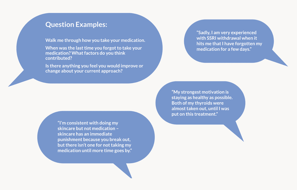
Interviews: I scheduled and jumped into my interviews quickly. I wrote questions that asked about their cues, routines, and lapses related to their medication.
Interviews: I scheduled and jumped into my interviews quickly. I wrote questions that asked about their cues, routines, and lapses related to their medication.
Interviews: I scheduled and jumped into my interviews quickly. I wrote questions that asked about their cues, routines, and lapses related to their medication.
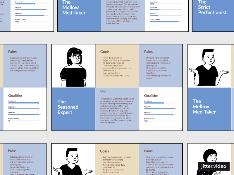
To help Dr. Preum further understand the target users for her potential app, and empathize with their perspectives, I organized my different interview participants into three distinct personas based on the real patterns I noticed across their behavior.
I compiled my interview insights into 3 scannable and data-driven personas: The Seasoned Expert, The Strict Perfectionist, and The Mellow Med-Taker, which I handed off to the partner.
This UX research project ended in a final handoff meeting with Dr. Preum, where I presented my process, results, and sent over my deliverables. Dr. Preum’s feedback was very positive, as she expressed excitement about moving forward with her project with the insights provided to her by me and my mentor, and even asked to continue our partnership.
We discussed the following insights, and I provided recommendations based on each one.
Insight 1: Most patients rely on memory and physical cues, especially cues in their morning routines, for medication reminders.
Recommendation 1: Use smartphones’ accelerometer functions to sense when the user is awake and notify the user by tapping into their existing cues and habits.
Insight 2: Patients are generally resistant to altering their current practices.
Recommendation 2: Introduce optional challenges or goals to gently encourage users to modify their adherence behavior and foster positive reinforcement.
Insight 3: Patients with less adherence claimed it was hard to stay motivated because they are only reminded of their medication’s benefits when they begin experiencing withdrawal.
Recommendation 3: Offer rewards for adherence, such as streaks or badges to create a sense of instant gratification missing from the medication experience for some users.
Insight 4: Change in location such as travel was the most commonly cited factor in forgetting to take medication.
Recommendation 4: Give location-based reminders for when the user is traveling. Provide users the option to set different reminders for different locations.
Conclusion
I conducted this UX research project for Dr. Preum’s adaptive medication reminder app. The insights I collected and worked into deliverables will guide the creation of an app that has the power to increase medication adherence by using Dr. Preum’s research of applicable machine learning algorithms, as well as effective UI/UX design.
Though I’m very comfortable with completing UX research as a means to inform designs, handing off my UX research was new to me.
I enjoyed extra focus I had to put into exploring my interview notes and completing thematic analyses to dig out useful personas for my partner. Having to pivot away from the diary study was daunting, but I realized it can be better to sacrifice some contextually-richer insights in order to get those answers elsewhere in the given timeline.
In reflecting on the questions I included in my diary study, versus the questions I asked in my interviews, I realized that in the end, the interview format was able to provide me with answers that cut deeper into the user’s motivations than the former, which recorded their behavior.
The client was excited to move forward in the project using the final deliverables. This project made me appreciate the depth and inherent value in UX research more than I had before, which is an attitude I have carried into my data-driven design work.