
Students Against Violence:
A Digital Engagement Re-Design
Students Against Violence:
A Digital Engagement Re-Design
Students Against Violence:
A Digital Engagement Re-Design

I worked with DALI (Digital Applied Learning and Innovation) Lab to address Dartmouth gender-based violence groups' lack of digital visibility and centralized source of information.
This project advanced my skills in professional negotiation and open communication with professional clients, as well as emphasized my principle of conducting deep, thorough user research to uncover the best compromises between the client's interests and the user experience.

1 in 10
1 in 10
Dartmouth students reported experiencing inappropriate sexual contact on campus (2021).
Dartmouth students reported experiencing inappropriate sexual contact on campus (2021).
SAPA + SPCSA
SAPA + SPCSA
Two Dartmouth groups which address sexual and gender-based violence on campus.
Two Dartmouth groups which address sexual and gender-based violence on campus.
Timeline
10 weeks
10 weeks
Team
3 designers
1 product manager
3 designers
1 product manager
Deliverables
Design System
Figma Prototype
Live Website
Design System
Figma Prototype
Live Website
Clients
Sexual Assault Peer Alliance
Student and Presidential Committee on Sexual Assault
Sexual Assault Peer Alliance
Student and Presidential Committee on Sexual Assault
Challenge
Challenge
Digital access to gender-based violence resources and student organizations at Dartmouth are unclear, outdated, and decentralized. Our clients approached us to streamline their digital presence and create an online safe space that contains information about gender-based violence resources and their organizations' efforts.
Results
Results
I completed a full design process in 10 weeks, from extensive user research to high-fidelity Figma designs, and eventually translated our designs to Wix, a user-friendly site building platform that our clients could easily use to continue updating their website with new resources and information after the handoff.
One of my biggest takeaways from the project was learning effective and professional communication with a client at a point of design friction.
Original Digital Presences / Websites


Here's what we were working with. I identified some of the following pain points:
Hard to find; embedded as a subpage within Dartmouth's Health Service website or hosted as an outdated site.dartmouth.edu
No calls-to-action for triggered users seeking to quickly access campus resources
Lacks descriptions of initiatives, and not a comprehensive list of resources.
Text-heavy, user-unfriendly, and disorganized; for example, the list of SAPAs is just a long list of names
SPCSA site (right side) has too many pages, making the site difficult to navigate
Original Digital Presences / Websites
Original Digital Presences / Websites
Here's what we were working with. I identified some of the following pain points:
Hard to find; embedded as a subpage within Dartmouth's Health Service website or hosted as an outdated site.dartmouth.edu
No calls-to-action for triggered users seeking to quickly access campus resources
Lacks descriptions of initiatives, and not a comprehensive list of resources.
Text-heavy, user-unfriendly, and disorganized; for example, the list of SAPAs is just a long list of names
SPCSA site (right side) has too many pages, making the site difficult to navigate
My Process
My Process
Research & Analysis: I deemed it especially important that we conducted thorough gender-based violence research through existing prevention websites, and interviewing students and professionals. Though the project was mapped out to be 10 weeks, I advocated for dedicating the first 30% of the the roadmap to an extensive, 2-pronged research plan.
Takeaways from Competitive Analysis
Language can make users feel supported (ex: "you have options")
Clean interface that clearly directs users to make informed decisions
User Interviews
Demographics
General student population at Dartmouth
Trained Sexual Assault Peer Advisors (SAPAs)
SAPA Board Executives
SPCSA Executives
I curated different questions based on the user groups.
For example, SAPAs were potential users of the website, but also have 40+ hours of training in trauma-informed, survivor-centric methods for addressing gender-based violence — thus, I tailored my questions to elevate their user experience and garner nuanced insight into making the website supportive to other users.
I synthesized our notes with affinity diagrams to identify key themes and pain points. Overarching themes included:
A desire for the website to be simple and professional, in order to normalize the use of resources even in the absence of an emergency.
Content writing and UI design must be clear, survivor-centric, and neutral
Needs + Goals:
Need 1: The website will be visited by victims of sexual and gender-based violence.
Goal 1: Our design must be non-triggering and visually simple. The terminology and website experience must be clear and straightforward.
Need 2: The general Dartmouth student population is unaware of the difference between SAPA and SPCSA. They are unaware of the resources available to them.
Goal 2: Our site structure must delineate the two organizations; their missions and resources must be distinct and visible.
Need 3: The current sites do not highlight current, updated work of either organization, making their efforts go unnoticed.
"We do so much work behind the scenes that isn't properly broadcasted right now"
Goal 3: Our site should display SAPA and SPCSA work in a scannable way for readers. It should also be easily updatable by the client so they can continue after handoff.
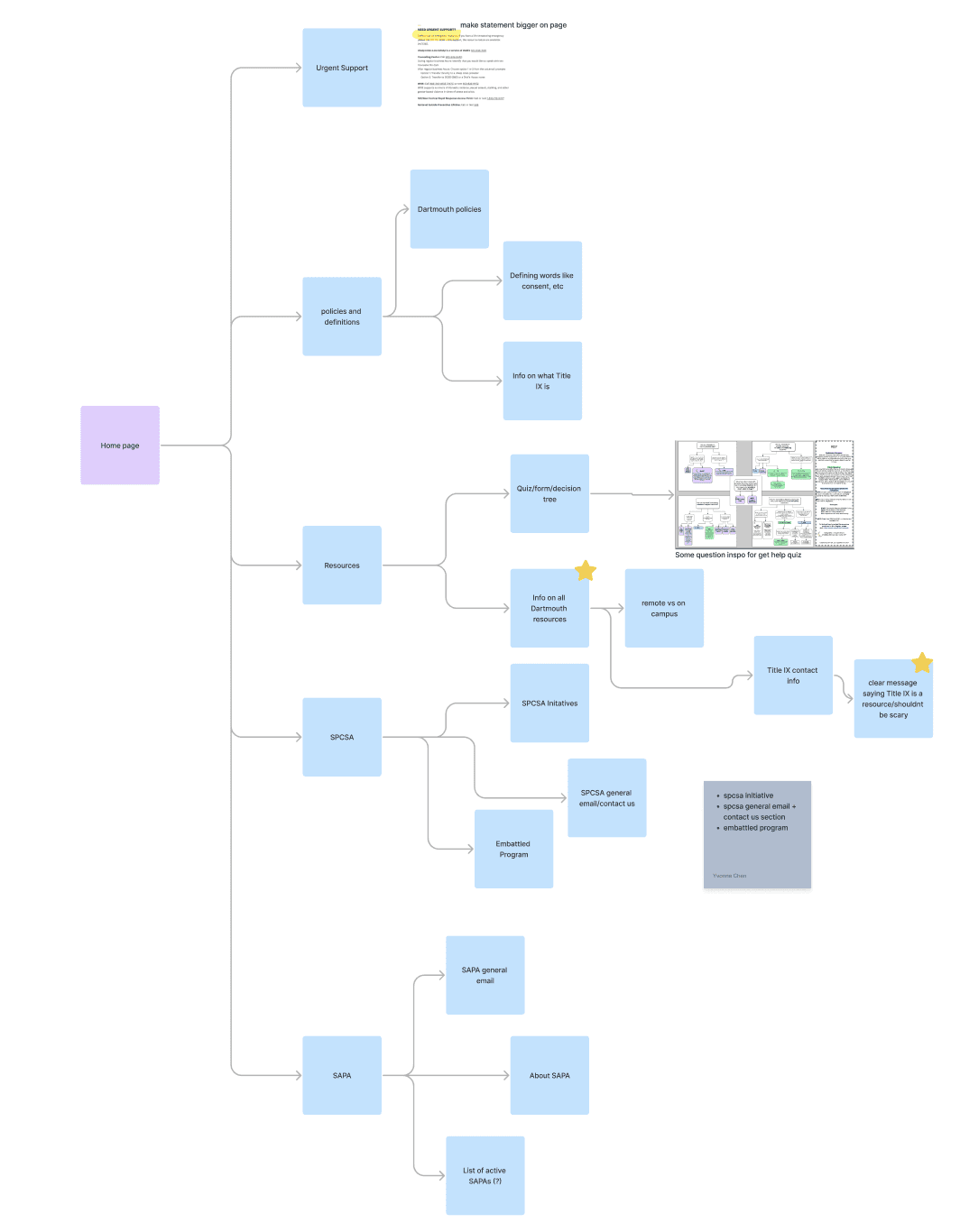
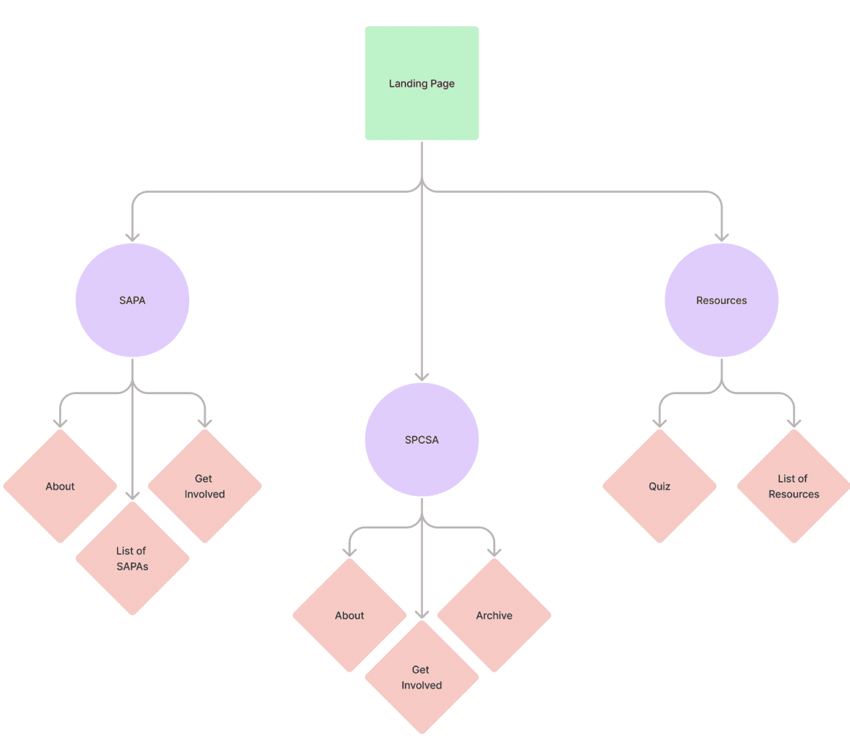
Site Architecture:
The next step was to brainstorm features of our design solution. I went through rounds of prioritization until I was able to create a preliminary wireflow of the website.
While we were able to map out our features well and organize them, the website became complicated and unintuitive. Interviews and client feedback showed that the site hierarchy was too "deep", and that our website would not have high click-through rates. In other words, our users wouldn't easily navigate through the site to find the resources.
I knew we had to reduce the depth of the site structure this to follow through with the goals we set after our research synthesis, so we conducted a card sorting exercise.
With 9 user testers, we sought to better understand how participants intuitively categorized pages of our website. With this collected data, we were able to refine our wireflow to not only be more shallow, but to drive our site's organization with the insights of what users were likely to have mentally grouped already.
Site Architecture:
The next step was to brainstorm features of our design solution. I went through rounds of prioritization until I was able to create a preliminary wireflow of the website.
While we were able to map out our features well and organize them, the website became complicated and unintuitive. Interviews and client feedback showed that the site hierarchy was too "deep", and that our website would not have high click-through rates.
I knew we had to reduce the depth of the site structure this to follow through with the goals we set after our research synthesis, so we conducted a card sorting exercise.
With 9 user testers, we sought to better understand how participants intuitively categorized pages of our website. With this collected data, we were able to refine our wireflow to not only be more shallow, but to drive our site's organization with the insights of what users were likely to have mentally grouped already.
Feature Brainstorm
Policies + Definitions page
Users need to be informed on Dartmouth definitions, which differ from general definitions. Intimidating policies like Title IX will also be provided in a digestible way.
Emergency exit button
List of contacts (SAPA + SPCSA)
Resources page
Must be discriminated by confidentiality
Differentiation between SAPA/SPCSA
Preliminary Wireflow

Refined Wireflow
More Refined Final Flow
Wireframing + Prototyping: I converted the final architecture structure into preliminary wireframes. Much of our team's focus had been on how to make the landing page display resources in a way that avoided triggering users while allowing them to quickly navigate to getting help immediately.

When we presented these screens to the clients, however, they emphasized that they wanted to prioritize presenting more direct information about their organizations rather than providing urgent support for victims.
We reached a point of design friction between our client's vision and what our user research pointed us towards.
To tackle this challenge, I pushed for increased communication channels and user-centricity. I collaborated with our product manager to develop a plan for our next weekly client meeting. I created another presentation of our research insights as well as our refined site architecture and card sorting insights.
We came to a synthesis during this meeting, compromising to have the landing page focus on guiding the user to SAPA or SPCSA content. We as designers also decided to take on an additional round of ideation to ensure that our resources page would be especially visually clear and experientially non-triggering to ensure that the user experience stayed true to our research.
I took initiative to urge the product manager to initiate asynchronous feedback from our clients more often to ensure that we maintained synthesis for the remainder of the project. The friction we ran into helped to turn our client relationship into a more openly communicative one, and our compromise as designers gave me the opportunity to creatively problem solve and iterate.
User Testing: We conducted user testing throughout our prototype development on elements like the side navigation shown below.
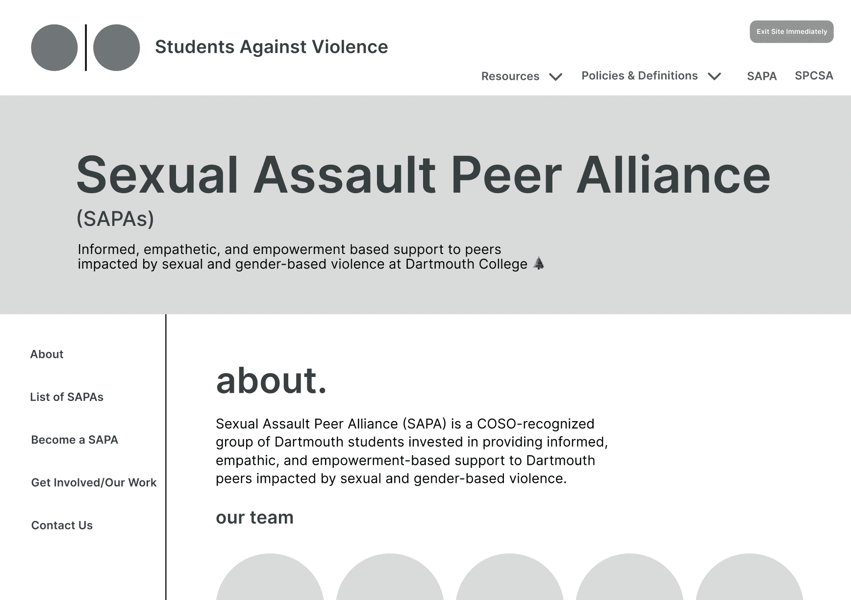
Style Guide: After running our grayscales through rounds of user testing and client feedback, we began transitioning to high fidelity screens.
The client gave suggestions for fonts they liked. Using their suggestions, I chose more accessible and professional fonts for the site. For color, I chose variations of teal, the official color of sexual violence prevention.

High Fidelity Prototype + Handoff: We iterated color, font, and style on top of our site architecture and grayscales, continually presented the screens to our client for feedback.
We began moving our designs into user-friendly website builder Wix to allow for the partner to continually update the website with new information without the help of designers.
Conclusion
Students Against Violence is a website which successfully addressed the challenge specs and succeeded in addressing a disorganized digital presence, resulting in a research-driven user experience. Working under a tight 10-week deadline with 2 other designers allowed me to amplify my skills in effective client and team communication.
Our clients were very excited about the final product, and are educated on how to update it properly for themselves in the future.
After launching, the site will benefit from being kept up-to-date and from additional user testing.
Wireframing + Prototyping: I converted the final architecture structure into preliminary wireframes. Much of our team's focus had been on how to make the landing page display resources in a way that avoided triggering users while allowing them to quickly navigate to getting help immediately.
When we presented these screens to the clients, however, they emphasized that they wanted to prioritize presenting more direct information about their organizations rather than providing urgent support for victims.
We reached a point of design friction between our client's vision and what our user research pointed us towards.
To tackle this challenge, I pushed for increased communication channels and user-centricity. I collaborated with our product manager to develop a plan for our next weekly client meeting. I created another presentation of our research insights as well as our refined site architecture and card sorting insights.
We came to a synthesis during this meeting, compromising to have the landing page focus on guiding the user to SAPA or SPCSA content. We as designers also decided to take on an additional round of ideation to ensure that our resources page would be especially visually clear and experientially non-triggering to ensure that the user experience stayed true to our research.
I took initiative to urge the product manager to initiate asynchronous feedback from our clients more often to ensure that we maintained synthesis for the remainder of the project. The friction we ran into helped to turn our client relationship into a more openly communicative one, and our compromise as designers gave me the opportunity to creatively problem solve and iterate.