


Best in Class (23S)
Social Impact Award
The app features a community-oriented and engaging user experience with a youthful and joyful interface.
Usability testing showed 90%+ task completion rates, positive user feedback, short learning curves, and short completion times.
We were awarded best project presentation in class and the Social Impact award due to our improvement of a problem with high-impact through user experience.
of testers would use this app
empathy map


Problems + Solutions: I directly translated my research findings into solutions that would maximize the user experience: first through on-paper sketches, then through designing low-fidelity wireframes. One of my "tells" as a designer is always being the one to pull out my trusty sketchbook and stretch my hands before I open Figma or Adobe Creative Suite.
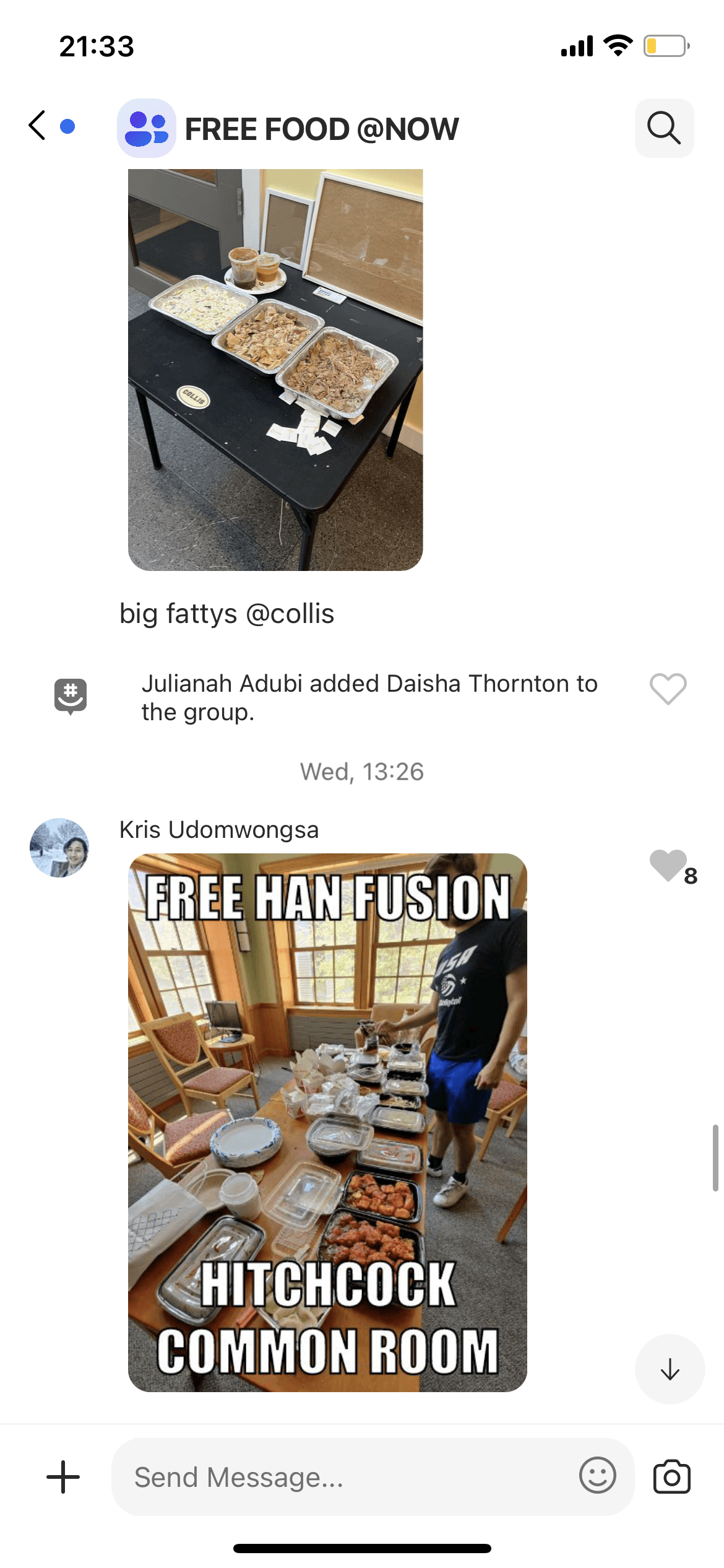
Problem A: While clubs and campus groups do host free food events with cultural cooking or catering, invitations are either unintentionally exclusive (only sent to club group chats) or decentralized (sent in emails, which get lost in the 100+ that are sent out by the college each day), resulting in low attendance and missed engagement opportunities.
examples of previous ways to access food and events:


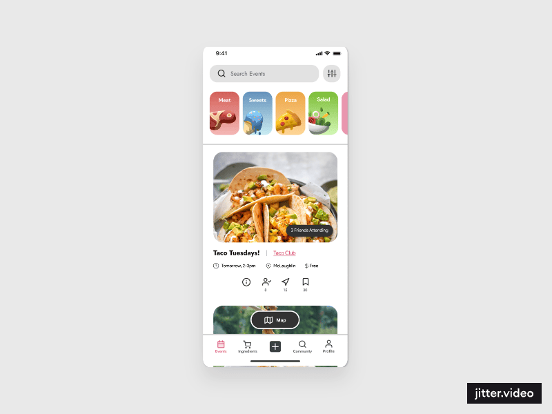
Solution A: I implemented a Gathering feed, a centralized place for clubs, campus groups, and individuals to post and/or join food-centered events. You can sign up, see how many others are attending, message in a groupchat for confirmed attendees, check the location of the event on a map, and even delegate ingredients out for attendees to bring.
Problem B: In dorms, buying ingredients for recipes can be expensive and wasteful. "When I bake with friends, I have to get a whole gallon of milk and entire carton of eggs, even if we use less than half of each of those," said one interviewee.
Solution B: I created a second feed for Ingredients, where individuals can post ingredients such as the remaining milk or eggs, leftovers from club events, and more. Users must "claim" the item, meaning that there is a depleting count of how much is left for the next user to claim.
Problem C: Each dorm kitchen contains a different set of specs: some have ovens, some don't, same with pots, pans, baking trays, salt, pepper, oil, and other supplies, which can make it difficult to plan events centered around cooking, or even cook for oneself.
Solution C: I designed a map feature which users can use to find kitchens and geotagged events. Users can also input information about which features the kitchen contains for other users to see.
With the MVP features identified from my research translated into app features, I moved onto refining my low-fidelity wireframes, layout, and navigation into high-fidelity, interactive prototypes from user feedback and usability testing metrics.
Usability Testing: With some my collaborator and I's iterations of UI on top of the UX I thought out, we conducted extensive user testing, including A/B testing.
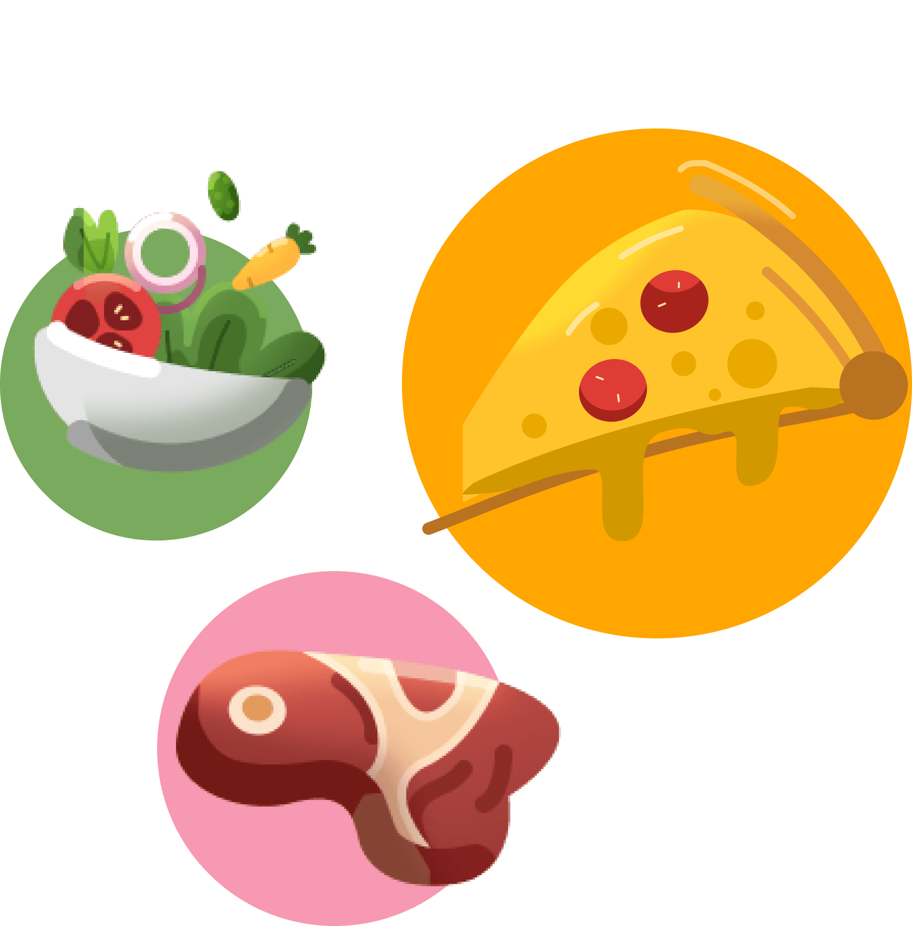
Select Categories
Select Time Range
Clear
Apply


3 selected
Today
This Week
Anytime
Custom Range


Select Categories
Reset
Apply
3 selected

Conclusion
The Potluck! mobile food sharing app buildout successfully addressed the challenge specs and succeeded in addressing a tangible campus issue, resulting in a quality user experience recognized for its impact.
The UX/UI design led to potential user adoption and usability tester satisfaction, demonstrating the value of thorough research to understand a problem, and thoughtful use of empathy and cognitive reasoning to solve the specific aspects of that problem.
Designing an app in a short time is a challenging yet rewarding rollercoaster that involves thorough research and thoughtful feature creation. Potluck! aims to provide a compelling value proposition, combining the best features of existing P2P apps and food-sharing solutions while leaving behind the inconvenient pain points, offering users exciting opportunity and a reason to open the app each day.